2026-09-22
Best Manufacturing Website Examples (2026) and What Makes Them Work
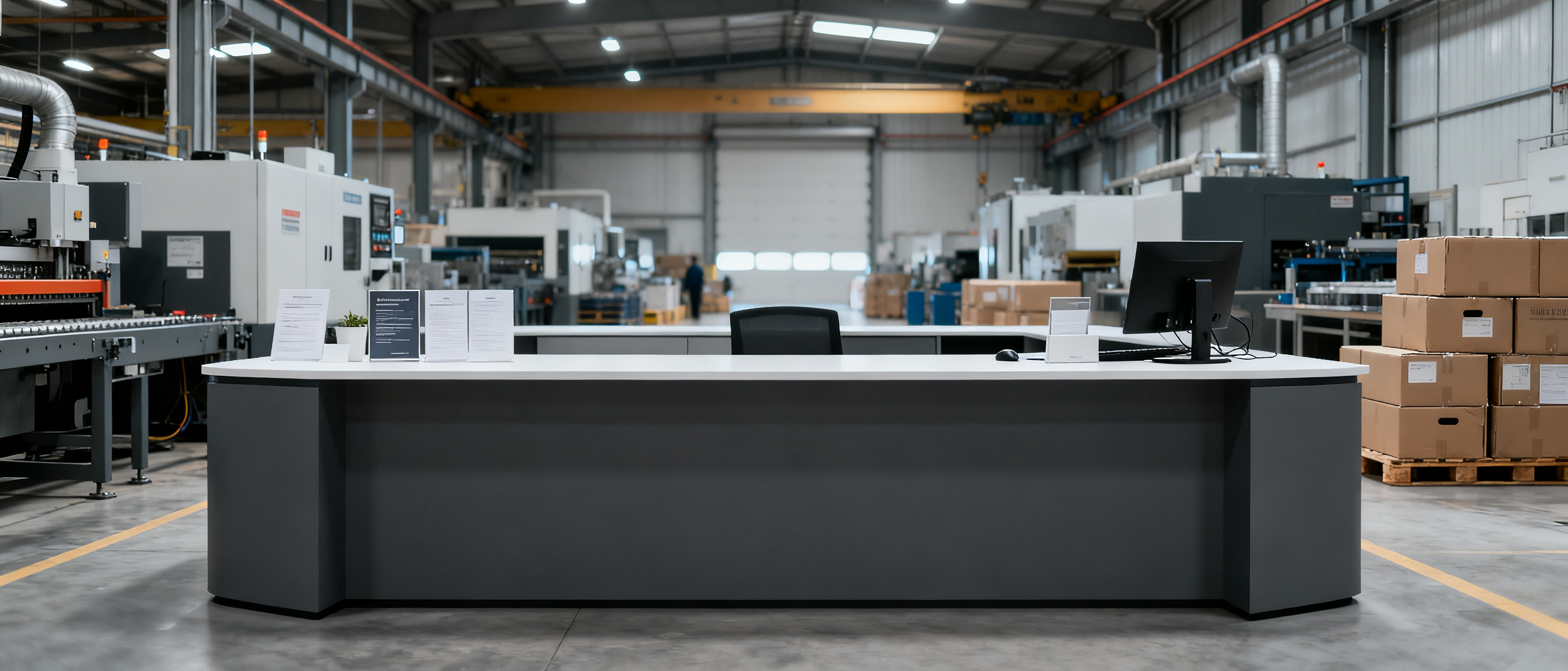
Studying the best manufacturing website examples (2026) and what makes them work reveals a consistent truth: the sites that turn browsers into RFQs aren’t design showcases—they’re supplier pages that a procurement manager can trust in under ten seconds. Speed, factual clarity, and visible proof outweigh visual fireworks every time. Whether you run an export‑oriented OEM factory or a regional small‑batch manufacturer, the same patterns decide whether an overseas buyer sends an inquiry or moves to the next tab.
What Buyers Scan in a Manufacturing Website: Trust Before RFQ
When a sourcing professional lands on a manufacturer’s site, they aren’t there to admire the layout. They are hunting for reassurance. The sequence is almost instinctive: authenticity first, capacity second, formality a distant third. That’s why the best manufacturing website examples (2026) and what makes them work start from the assumption that a visitor already doubts everything—and they answer those doubts immediately.
From hundreds of observed buyer sessions across export desks, the pieces that actually move the needle are:
- A visible, real factory address and direct phone line (not a virtual office)
- Genuine workshop or production‑line photos, ideally with date stamps
- Certifications (ISO, UL, CE, TS‑equivalent) displayed as a scannable badge set, not hidden in a PDF
- Clear, jargon‑free description of what the factory actually makes, not just what it sells
- Loading speed fast enough that the critical trust badges appear almost instantly
Put another way: a procurement scanner is looking for reasons not to trust you. The more friction you remove, the more likely they’ll type an email address. Even a single stock photo of an unrelated robot can undo all the hard work.
| Trust signal | What the buyer actually checks | Impact on RFQ likelihood |
|---|---|---|
| Real factory photos | Exterior sign matches company name; machinery in use | High: removes “trading company” doubt in seconds |
| Certification badges | Visible ISO/CE/UL marks (not buried in downloads) | High: shows a verified production bar, not just self‑declaration |
| Physical location & contact | Street address, landline, export‑desk email | Medium‑High: a missing address often kills the session |
| Capability specifics | Exact tolerances, MOQ, materials, lead time logic | Medium: shortens the pre‑RFQ mental checklist |
| Page load time | First Contentful Paint under 1.8 s on mobile | Silent gate: >3 s on 4G and 53% of sessions abandon |
That last row is often overlooked. A heavy page that loads cereal‑box‑sized photos drags the whole trust check into a stutter, and the buyer is gone before the hero image appears. The best manufacturing website examples (2026) and what makes them work treat performance as a trust feature, not an afterthought.
Key Elements That Make the Best Manufacturing Website Examples (2026) Work
Across actual live sites that sourcing teams return to—factories producing plastic tooling, hardware, textile blanks, custom‑manufactured metal parts—several elements repeat with striking consistency. They are not expensive to build; they are just opinionated about what must be present.
- A concise “what we really make” paragraph. Buyers don’t want to read a list of 200 parts. They want one sentence that tells them you mold precision ABS enclosures or you knit 100% cotton jersey blanks in Lot sizes of 300–1,200 kg. This reduces the mental burden of “is this supplier even in my category?”
- One‑page capability summary. Best‑in‑class examples dedicate a single scrollable view to process standards, material grades, surface finishes, and compliance marks—often with a downloadable technical sheet. No multi‑level menus required.
- Production environment proof. Not a slideshow of 12‑megapixel beauties. Two to five wide‑angle shots of the actual floor, with workers, lighting, and machinery. Date‑stamped candid images weigh more than any brochure.
- Certification & compliance hub. A clean row of badges linking to verification pages (or at least showing certificate IDs) is sufficient. Buyers accustomed to Alibaba and Thomasnet expect to see this on an independent domain too—it signals you are not hiding behind a marketplace’s guarantee.
- A quiet, generous inquiry path. The best examples use a simple contact block at the bottom of every page: company email, direct phone, and an optional form with auto‑fill fields. They never gate the RFQ process behind sign‑up walls or mandatory registration.
Notice what’s absent: carousels, “innovative solutions” buzzwords, generic stock images of futuristic factories, or elaborate parallax effects. When the goal is procurement trust, less is genuinely more. If you want to dig deeper into what separates a supplier page from a full CMS project, our blog covers manufacturing‑site fundamentals without the jargon.
Design Choices That Speed Up Procurement Decisions
A sourcing manager’s patience is measured in seconds, not minutes. They are often working on a patchy 4G connection, on a mid‑range Android device, trying to confirm a supplier before a morning deadline. Every design decision either pushes them toward an RFQ or pushes them away.
Google’s own research shows that when a page moves from 1 to 3 seconds of load time, bounce probability increases by 32%. For a manufacturing site, that translates directly into lost inquiries. The best manufacturing website examples (2026) and what makes them work bake speed into the structure:
- Lean HTML and minimal JavaScript. Avoid front‑end‑heavy frameworks that require client‑side hydration before text appears. Static or server‑rendered pages deliver content in the first network round‑trip.
- Optimized image formats. WebP or AVIF images with
srcsettailored to mobile viewports shrink payloads by 50–70% without sacrificing perception of quality. - No hero video above the fold. A static image with a crisp value proposition is scanned faster, loads quicker, and doesn’t hijack the network.
- Mobile‑first, not just responsive. Buttons large enough for thumbs, form fields that don’t require pinch‑zooming, and a layout that never truncates critical contact info.
- Caching and content delivery. A CDN that brings assets close to buyers in Europe, the Americas, or the Middle East shrinks latency to under 100 ms, which directly improves Core Web Vitals scores. (Web.dev’s Core Web Vitals guide explains the metrics in detail.)
These are not complex or expensive changes. However, they demand that the manufacturer treats its website as an asset with measurable business metrics—not merely a digital business card that sits untouched for four years. A 1.5‑second first contentful paint on a €150 phone is one of the strongest trust signals a procurement scanner never consciously names.
Common Mistakes That Undo a Good Example
Even when a manufacturer invests time in building a site, a handful of recurring missteps can turn a potentially strong showcase into a buyer‑repellent. Based on real export‑desk feedback, these are the pitfalls that repeatedly break the trust chain:
- Obligatory “About Us” that says nothing. “We are a leading enterprise committed to quality and innovation” is a placeholder, not a differentiator. It leaves the buyer with zero proprietary knowledge.
- Contact forms that require registration. If the prospect must create an account before they can ask about the product, you’ve already lost most legitimate buyers, who will simply open another supplier’s page that doesn’t fence the inquiry.
- Auto‑playing videos with sound. In an office environment (or behind a VPN), this is a deal‑breaker. Many scanners close the tab the moment unsolicited audio fires.
- Generic stock photography of unrelated factories. A clean white lab with nobody they’ll ever meet sets off alarms. If you can’t show your own floor, show a technical diagram instead of a borrowed photo.
- Hiding essential details inside a multi‑megabyte PDF catalog. Buyers want to scan spec tables on the site, not wait for a download that might set off their corporate firewall. Offer a lightweight digital card or brochure that loads instantly and preserves the information offline.
- Forgetting mobile performance entirely. Even if 60% of your leads come from desktop B2B traffic, the remaining 40% on mobile will leave if your Core Web Vitals fail (the Google Search mobile‑friendly guide outlines what the crawler now expects).
Each mistake is individually small, but together they signal a lack of empathy for the buyer’s situation. The best manufacturing website examples (2026) and what makes them work remove every one of these frictions, often so subtly that the buyer only feels the ease, not the absence of obstacles.
FAQ
What should a small factory’s website ideally look like in 2026?
It should look like a single‑page (or very compact multi‑page) presence that a procurement officer can scan on a phone during a coffee break. The essentials are: real factory photos, clear capability summary, visible certifications, direct contact details, and loading speeds under two seconds. You don’t need a portfolio of 50 products; you need one credible line that proves you actually manufacture what you claim. Most top‑performing manufacturing sites today feel more like a well‑structured leaflet than a corporate portal.
Do I need an expensive web design agency for a manufacturing website?
No. The features that drive B2B trust—clarity, speed, and verifiable facts—do not require a custom design sprint or an Enterprise CMS. Many high‑converting manufacturing sites are built on lightweight static‑site approaches or managed packages that handle the technical load without ongoing maintenance. What matters is that the site gets out of the buyer’s way. An agency is useful only if you need complex integration or heavy catalog management; otherwise, an opinionated, template‑driven setup often produces better procurement outcomes because it avoids unnecessary visual bloat.
Is mobile performance really critical for B2B manufacturing sourcing?
Yes, increasingly so. While B2B queries still come heavily from desktops, mobile usage in supply‑chain research has grown steadily. More importantly, Google now indexes and ranks pages using a mobile‑first crawler, and poor mobile Core Web Vitals can drag down visibility even for desktop searchers. A manufacturing site that takes four seconds to become interactive on a mobile device will not only lose impatient buyers but also underperform in search results. The fastest path to credibility is a site that feels instant on any device.
References & Further Reading
- Core Web Vitals – web.dev – Metrics and thresholds that define a smooth page experience.
- Mobile‑friendly sites – Google Search Central – Why mobile design matters for indexing and ranking.
- Manufacturer Website Essentials – Thomasnet – Practical trust‑building elements from an industrial marketplace perspective.
- Pages with Static Generation – Next.js Docs – How static site generation works, a common approach for performance‑focused manufacturer sites (technical reference).
- B2B Frontage Blog – Additional articles on supplier‑facing site structure, buyer behavior, and lightweight web presence.